
Brand Guide
Brand personality
naming
The name HEALIOS is the compound and evocative association between the word “healing” and the suffix “ios” (pertaining to, belonging to, in Greek). The phonetics of the word [hi : lios] are easily pronounced in English and Spanish.
HEALIOS ™ is a registered trademark with IMPI in Mexico.
Core message
Who do we want to be
HEALIOS is a private healthcare brand of high-end, multi-disciplinary medical hubs.
Its niche competitive market positioning is focused on delivering complementary and multi-disciplinary elective medical and surgical turnkey specialties that only require outpatient care.
The identity of HEALIOS rests on the 3 Pilars of:
- Private Healthcare hubs for multidisciplinary medical and dental specialities.
- Innovation.
- Quality of Service and Care.
What are our values
Mission
HEALIOS aims to deliver private healthcare services that instill confidence, foster connection, promote innovation, ensure quality, and inspire trust.
Our Values
- Excellence
- Trust
- Care
- Innovation.
Who do we build for
The target market consists on one side of the medical and dental professionals who will lease or buy spaces for their private practices, and on the other the private patients of those professionals.
- Medical, surgical and dental professionals of elective specialties seeking to grow and promote their private practices by leasing or investing in a specialized, high-end medical hub with complementary specialties, amenities and services.
- Middle-class Mexicans and Expatriates seeking private health care services. Specifically, elective medical and dental treatments in a multi-lingual outpatient center equipped with complementary services located in one place.
What impact do we want to make
The private healthcare industry in Mexico has an overall positive reputation, although many foreigners who have not experienced it directly tend to have a vision of the private health care as “good value”, which can also mean “cheaper”, with lower expectations in terms of quality.
HEALIOS fills a market gap for a purpose-built multi-disciplinary private medical center offering highly requested elective specialties, and providing a level of service up to international standards.
What promises can we make
- A group of premium, multidisciplinary private medical hubs, in key Mexican residential and touristic locations, that provide highly requested elective medical and dental specialties and complementary services dedicated to out-patient care.
- An innovative purpose-built design with flexible leasing and buying options for medical professionals who want to grow the private practices as affiliated partners.
- The highest level of customer care in a multilingual environment that is patient-focused and meets international quality standards.
brand attributes
Brand attributes are fundamental for the identity of the brand because they define and communicate how business will be conducted in a way that is consistent with the expectations that customers have about the brand.
Whether we’re communicating verbally or visually, or setting training standards, brand attributes are the compass that gives the direction to take on how to conduct business.
BOLD: The verbal and visual style to adopt in communication and in business. In contrast with politically correct, low key, standard, average, cliche and unimaginative.
DEPENDABLE: The ability to act consistently and reliably on what is promised.
VIBRANT: The positive feelings of friendliness, human connection and positive energy that is reflected in the brand name and projects a welcoming atmosphere that is expressed through warm, bright and vibrant organic colors.
BEST IN CLASS: Healios is setting high expectations to deliver high standards in quality of services that will redefine customer experience in the private medical sector.
INNOVATIVE: Being solution-driven , the ability to listen to what our market requires and expect to solve life style problems in way that are innovative and responsible.
TRUSTED: The act of being always accountable and take responsibility for our actions, choices and promises with our customers.
tagline
A tagline is a slogan, statement, or guiding principle that makes an identity statement about the brand’s mission. The tagline should always be in English and never be translated to avoid losing its substance.
The Healios tagline can be used on any advertising media, where space allows and context is relevant. It should be used with the relevant Healios typeface and in italic, using capitalized letters.
"Quality Healthcare in Action"
Brand identity
logo
The job of the logo is to facilitate recognition and recall.
A logo is a point of identification, the symbol that customers use to recognize our brand and instantly connect its sight with the memory of what our company does —and more importantly, how it makes them feel.
The HEALIOS logo starts with the premise that the medical industry is often perceived as cold, formal and often lacking connection and empathy. Our logo aims to make a bold claim and be distinctive, simple and memorable.
HELIOS differentiates by being focused on the values of healing and positive energy—empowering people in their health decisions—and in human connections. The heart with a negative H is simple and memorable, and symbolically represent a strong emphasis on human connection and care. The color red is a good fit for the heart and creates a sense of positive energy, warmth, and hope.
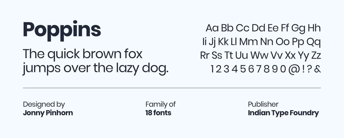
Because the brand attributes dictate bold, innovative and vibrant qualities, we use the geometric sans-serif typeface Poppins for the wordmark for its strong personality and a friendly, slightly rounded form.
Logo Usage
The HEALIOS logo should be used using the following guidelines:
- The logo should only be used on white or light backgrounds, never on black or inverted, unless it is a small version of the white brandmark.
- The primary or stacked versions of the logo can be used depending on the space available, but care must be taken to always use clearspace.
- The minimal width sizes for the logo is 150px for the primary, and 100px for the stacked version.
- Whenever possible, the SVG versions of the logo should be used for optimal rendering.
clearspace
A logo needs space around it in order to visually stand out and function as intended. The logo requires a clearspace equal to the height of the wordmark as it stands next to other visual elements.
brandmark
The HEALIOS brandmark can be used on its own as an icon, on white, red or secondary color backgrounds, if space does not allow the use of the full logo. As for the logo, the SVG version of the brandmark should always be preferred to ensure high resolution and scalability.


spacer mark
The HEALIOS spacer mark is a graphical device used to create a sense of depth and symmetry, and break the white space in design, as it can be seen on the applications examples below.

colors
Color is one of those areas where we must achieve as much as possible, with as little as possible. The right color scheme will help get user attention, shape the right emotions and build positive associations with our brand.
The choice of colors is be determined by the ability to offer equally optimal contrast on dark and white backgrounds. The HEALIOS palette consists of a red brand color used as accent, and secondary complementary colors that bring light when combined with the dominant use of pure white..
The red palette is very distinctive and designed to evoke positive energy, taking action and warmth. As a color, red already enjoys a positive association with the healthcare world thanks to the Red Cross.
HEALIOS Red
Dark Red
Soft Pink
Soft Blue
Lucent White
Bright White
Pure White
Black 6 C
Color proportions
The palette is predominantly monochrome with dominant colors as white, light cool grey, soft pink, baby blue, and using a lot of white space. We use the 60-30-10 rule for creating a balanced sense of harmony and visual comfort in the design. The white dominant color should take up 60% of the design, the secondary colors take up 30%, while the accent brand color can take up to 10%.

Color usage
When using graphic elements formatted for Print, Pantone Matching System (PMS) values should be used for optimal color fidelity and compatibility.
- The primary red is used for accent in light touches, small surfaces and backgrounds, links, buttons, actionable elements, and for accessories, signs and furnitures in interior design.
- Secondary colors such as Soft Blue, Bright and Lucent White and Soft Pink are used for backgrounds elements, and can be used for walls in interior design as well as for staff uniforms.
- Body text and dark backgrounds use Black 6 C Pantone color, very sparingly for contrast only.
- The dark version of the brand color red is used for contrast on actionable accent elements
typography
Type is what meaning looks like.
The style of typeface family is yet another form of non-verbal messaging we are sending out about our brand. The choice of typographic family helps to tie all communications together, from the copy on the website, email marketing, creating brand consistency and memorability.
The primary typeface chosen for headings and body copy is the open source humanist sans serif Libre Franklin, an interpretation and expansion of the classic Franklin Gothic typeface.
It’s a versatile sans-serif, suitable for both long-form text and headlines. At large sizes, the distinctive rounded corners of the characters become apparent. It is known for its modern and balanced lines and for its unique legibility and scalability. Libre Franklin offers a modern, clean and professional aesthetic.

The typeface chosen for the logotype is the open source geometric sans serif Poppins.
Each letter-form is nearly mono-linear, with optical corrections applied to stroke joints where necessary to maintain an even typographic color. It suits the Healios logotype in lowercase for its balance and simplicity.
BUTTONS
Actionable, or "Click to Action" (CTA) buttons on the web must be well differentiated from other graphical elements, using HEALIOS Red, and should be intuitively easy to identify as clickable elements. Buttons should always be clearly labeled to indicate the expected outcome for the user.
Buttons can either be primary or secondary according to the hierarchy of importance and the way they need to blend with the design. A version with an icon can help enhance visual comprehension and an animated version can optionally be used. The primary button uses a linear gradient between the brand red colors to enhance recognition of an actionable element.
images
Communicating With Images
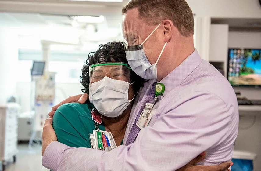
Photography can play a big role in delivering a brand's message and conveying its personality. By incorporating real and positive images of people, both patients and professionals, taken in the context of healthcare, we can deliver the message that HEALIOS stands for care, quality of service, human connection, and values health, shared experienced and communication, in the manner that the Cleveland Clinic has so efficiently conveyed in its advertising and communication campaigns.
- All photography used must be high resolution images with excellent color quality and a good use of high contrast for the best possible definition.
- Plenty of white space should be left between design elements and images on display or in print.
- Photography should always incorporate people, even when showing premises, either smiling professionals in contact with the public, or patients themselves, and whenever possible stock images should be avoided to prefer real life subject.
- When using background images, choose images familiar to the public and abstract them by using a close-up or cropped image. This will help create texture as well as take away the focus from the subject matter while still being very familiar.
- Images used as background should be retouched with filters and opacity enhancements to ensure that text overlay is always highly legible.
- Images carousels should be avoided, as they are inefficient and distract the attention of users from focusing on the message being conveyed.


icons
We recommend that icons be used sparingly in web design. Icons can b helpful and graphically pleasing, but they should not be overused and their meaning is often not intuitive as we tend to think, requiring that they are always accompanied by the relevant caption to ensure the signified is not lost on users.
For HEALIOS, we use outlined icons (not filled) of 100 stroke weight, that are friendly looking and illustrative, of medium size (50-100 px) and designed with soft curves.
The format should always be SVG to ensure high scalability, and to match the color of the typography. The icons should always be placed on Pure White or Lucent White backgrounds.


We also use the Google Material Symbols library for SVG icons, using outlined icons of 200 weight, and 48 dp optical size, using black or HELIOS Red, and sizes varying between 48px and 72px.
File resources
download assets
File assets for our logos as well as typefaces can be downloaded from our Google Drive.
Those assets are available either as PNG or SVG files for graphics, and as TTF files for variable fonts.
Please note:
- Whenever possible, the SVG versions of the logo should be used for optimal rendering.
- Google Drive does not permit to view SVG files directly, so they must be first downloaded to your computer, then viewed or opened with whatever graphic software you use locally.
- OpenType is the standard font format in common use. There are two subformats: TrueType (with the extension of .ttf) and CFF (.otf).
Download FONTs
Poppins
Libre Franklin
Download LOGOS
Applications
advertising
The example mockups below are used to show the brand identity in action with examples of how colors interact with messaging and layouts and how the different versions of the logo can be used according to white space and to image size.
Please note:
- White, Lucent White and Bright White should always be the dominant colors, representing no less than 60% of the design, with plenty of white space between graphical elements.
- HEALIOS Red brand color is used as accent (roughly 10% of the design) , but can also be used for smaller backgrounds or to add a high level of contrast for white messaging.
- Soft Blue and Soft Pink can be used for backgrounds, representing no more than 30% of the design, to soften the perception and break the white dominance.
- Black should be used very sparingly, to add contrast, no more than 1 or 2 % of the design.
- The spacer mark is used to bring symmetry and occupy white space in corners as a visual brand clue that adds contrast and balance in the design.
example applications


